In theory, the patient portal is a beautiful thing. A place I can go to get all of my health data and communicate with my doctor. Any bit of health information I could ever want is there, catalogued for me within a carefully crafted user experience that keeps me informed and healthy.
This great new portal has a mobile app for my iPhone so I always have the information I need in real-time. I can see my recent x-ray from when I broke my ankle, schedule an appointment to deal with this nagging cough, or renew my meds. If I want, I can even pay my bill, all from the same place.
And that’s how I imagine the original vision of the first group of engineers to take on this task . The physicians, administrators, and healthcare visionaries set out to build it and were determined to change the way patients interacted with their care. It was a vision centered on improving patient care and outcomes.
But that dream is dead.
The hard truth about patient portal usage
It’s been 20 or so years since the original pioneers of portals started designing out the first portal. Unfortunately, their dream is no more realized now than it was then. They introduced it to the world under the false assumption that patients wanted all these things wrapped up into a single platform.
Steve Jobs said:
“Customers don’t know what they want until we show them.”
I think that logic applies here. Portal adoption is abysmal. Unfortunately, patients just don’t use them.
If you’re thinking “I love my portal!”, I get it. There are some of you out there that really get a lot of value from it. I acknowledge that your kind do exist, but the numbers show that you’re in the minority.
It’s also important to note that there have been a few success stories:
The big success story is from Kaiser Permanente. By 2015, Kaiser Permanente had registered 70% of their 5.2 million patients on their patient portal. In 2015 alone, 23 million secure messages were sent. Impressive!
But here’s the thing: Kaiser isn’t just a large grouping of hospitals and practices. They are also the nation’s second largest insurer. The incentive for Kaiser to drive portal adoption for their roughly 10M members is HUGE. A massive health system like Kaiser benefits when patients are healthier and engaged in their care. Considering they generate $60B in operating revenue annually, you can imagine that if the portal drives down cost for them by even just a fraction of a percent, we’re still talking big bucks.
In contrast, the vast majority of hospitals and health systems today get very limited return on investment (ROI) from their clunky portals.
Where did the patient portal go wrong? Seemingly every step of the way.
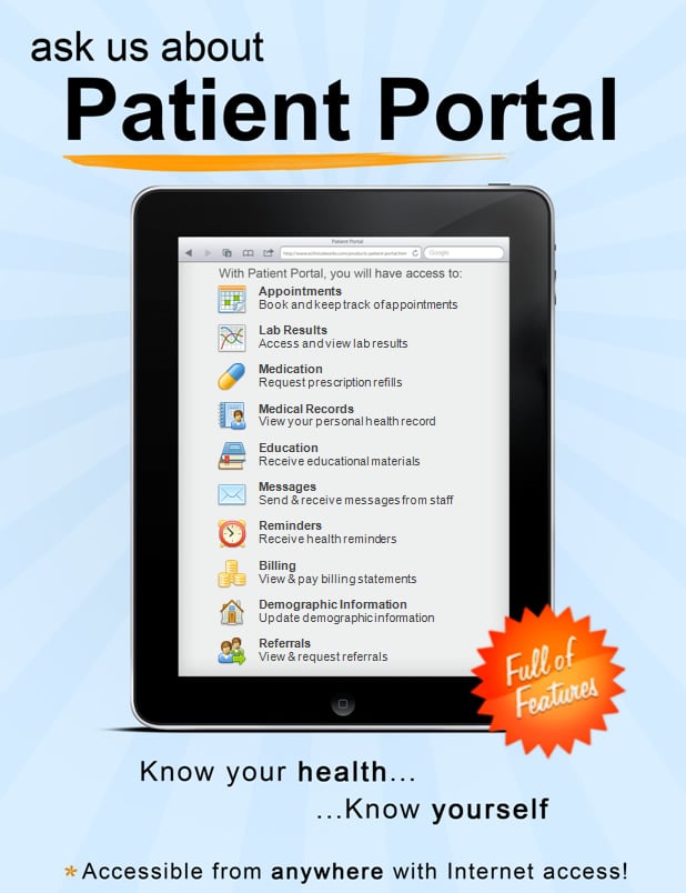
All the features
I picture the original portal visionaries sitting around a table, slowly edging towards the front of their seats with each new suggestion for a feature that patients were going to LOVE. They list an array of valuable features that no patient would ever want to live without:
- Prescription renewals
- X-rays
- Lab Results
- Secure messaging with a doctor
- Appointment scheduling
- Bill pay
- Patient education materials
A white board on the wall fills with design ideas until they come to an agreement. They are going to change healthcare.
Then they celebrate the future and the change that the portal would bring to healthcare. The team builds exactly what they set out to build, and it is ready for primetime.
Getting patients to use it
With all these features, they shouldn’t have an problem getting users. What patient doesn’t want all these great features?
As it turns out, getting patients to sign up has proven far more difficult than anticipated.
Why? Consumer technology (the apps we all use in our daily lives) typically solve a problem in a very simple way. When I need to get somewhere, I use Uber. If I’m hungry, I use Seamless. If I want to snap a beautiful picture of a sunrise over the mountains across a lake, I use Instagram.
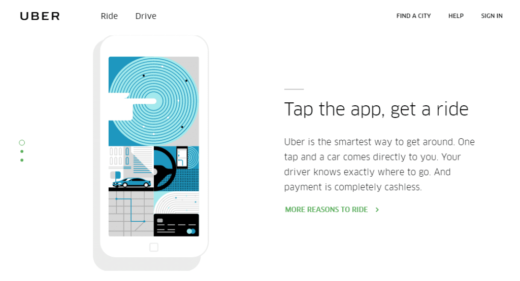
Each app solves a problem very well in addition to making it ridiculously simple. When you compare the value proposition in the Uber image above with the portal marketing flier, it’s easy to see the differences. One is complicated, and the other is simple.
Simplicity
The simplicity of successful consumer tech companies is often a major contributor to their success. Even Facebook recently pivoted from offering all functionality in a single social media platform to breaking out functionality into separate apps, like Facebook Messenger.
When asked why he made this change, Mark Zuckerberg replied, “We wanted to do this because we believe that this is a better experience. Messaging is becoming increasingly important. On mobile, each app can only focus on doing one thing well, we think.”
So if Zuck is right, and I have to believe he is because he has access to more data than God, patient portals got it all wrong with the bright orange “Full of Features” badge.
The evidence
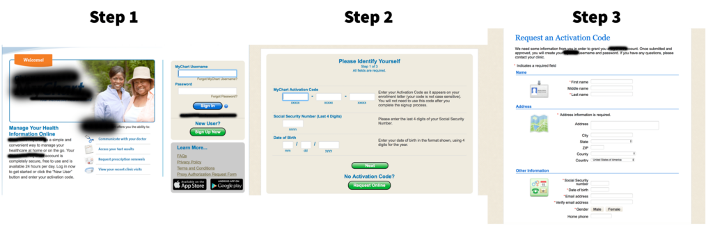
A new study shows that “96% of patients report leaving their doctor’s office with limited knowledge of how to use the portal. Of the 40% of patients who said they had attempted to use the software in 2016, 83% said it was too complicated to use.”
That means only 7% of patients find it simple enough to use, and actually care to use it.
7%
As a point of reference, 7% of the American population also believes the moon landing was faked, if that helps give you some perspective.
While the efforts to get patients onto portals haven’t yielded good results, most hospitals and practices will actually stop at nothing to get you using their portal. A program called “Meaningful Use” requires them to meet certain regulations that increase their Medicare/Medicaid reimbursements.
Stop. at. nothing.
I witnessed one particular hospital assign a nurse to every patient as they left the exam room. The nurse sat down with the patient, registered him for the patient portal, showed him the all the features, and then had him send a “test” secure email message.
This approach meets the short term goal of getting those Meaningful Use dollars, but if we assume the study above applies, we can assume 93% of patients will never come back again.
This is clearly an instance of a round peg in a square hole. We know we need to engage patients, and we refuse to believe that the portal can’t deliver.
So now what?
We continue to learn from consumer technology, and more specifically, mobile apps. Consumers download and use apps that are simple and do one thing incredibly well. If we’re expecting to really bring value to patients and engage them in their care, we first need to simplify every step of the process in addition to the product itself.
The same hospital CIOs and decision makers that implemented the portal are still pushing them to patients, but something else is going on. They are simultaneously rolling out simple, more focused solutions that overlap portal functionality. And it’s only a matter of time until these solutions demonstrate more value than the portal ever has. Why? Because patients use them.
Finally, digital health has reached a turning point. Health tech companies are focusing on different ways to capture the attention of patients in an effort to improve health and engagement. Through the lens of consumer tech adoption we can innovate healthcare and find a way to deliver on patient engagement dream of the patient portal…may it rest in peace. Do not resuscitate.